Saturday, 28 June 2014
EXP3 Final Submission:
1. MUSHUP ARTICLE:
Architecture is always about combining a lot of knowledge…knowledge of technology, economy, aesthetics and social issues. However, at the end of the day, a consumption-driven society will always long for something new. Hence it is possible that, by mixing architecture, engineering, product design and interaction, it expects fluency in methodologies from future designers. The possibilities became even more dizzying with the introduction of new materials and building technologies. As the role of engineering became ever more prestigious, a seductive idea arose: perhaps architectural excellence could be reduced to function. These relationships blur the distinctions between digital and physical, natural and artificial, simulated and observable in the wild. Such an interpretation calls for broader collaborations and a commitment to explorations outside established “comfort zones,”developing a stronger understanding of the possibilities of the digital construction and design process. In the face of daunting challenges, these projects had to advance well beyond contemporary practices and are now seen as precursors – respectively – to form-finding approaches, computational structural analysis and integrated designing of complex geometries
2. One-Point Perspective:
Library:
Folly and space for relaxed:
Architecture is always about combining a lot of knowledge…knowledge of technology, economy, aesthetics and social issues. However, at the end of the day, a consumption-driven society will always long for something new. Hence it is possible that, by mixing architecture, engineering, product design and interaction, it expects fluency in methodologies from future designers. The possibilities became even more dizzying with the introduction of new materials and building technologies. As the role of engineering became ever more prestigious, a seductive idea arose: perhaps architectural excellence could be reduced to function. These relationships blur the distinctions between digital and physical, natural and artificial, simulated and observable in the wild. Such an interpretation calls for broader collaborations and a commitment to explorations outside established “comfort zones,”developing a stronger understanding of the possibilities of the digital construction and design process. In the face of daunting challenges, these projects had to advance well beyond contemporary practices and are now seen as precursors – respectively – to form-finding approaches, computational structural analysis and integrated designing of complex geometries
2. One-Point Perspective:
3. Two-Point Perspective:
4. 36 Custom Textures:
5. Two Marking Sheet:
6. Sketchup Model:
Two elements are elevator and moving glass doors of the entrance.
7. Lumion Environment and School Picture:
The Concept: The concept of designing this school is that let students' imagination can be free and inspired by the nature. The building is largely have the combination with the nature and surrounding environment.
The First Moving element is elevator. it controls whole connection of the separated room:
The second moving element are automatic glass entrance doors:
The interior scene:
Folly and space for relaxed:
Lecture Theatre:
Studio room and Computer LabWednesday, 4 June 2014
Wednesday, 21 May 2014
Friday, 16 May 2014
EXP 3: Week 1 Valley and articles
The real valley from Europe
Building in the Lumion
The Mash up 3 article:
How should the architects of tomorrow learn? In an age of frontier technologies and open-source prototyping, the future is about rethinking the discipline as a dynamic system of relationships. Architecture is always about combining a lot of knowledge…knowledge of technology, economy, aesthetics and social issues. However, at the end of the day, a consumption-driven society will always long for something new. Hence it is possible that, by mixing architecture, engineering, product design and interaction, it expects fluency in methodologies from future designers. The possibilities became even more dizzying with the introduction of new materials and building technologies. As the role of engineering became ever more prestigious, a seductive idea arose: perhaps architectural excellence could be reduced to function. These relationships blur the distinctions between digital and physical, natural and artificial, simulated and observable in the wild. Such an interpretation calls for broader collaborations and a commitment to explorations outside established “comfort zones,”developing a stronger understanding of the possibilities of the digital construction and design process. In the face of daunting challenges, these projects had to advance well beyond contemporary practices and are now seen as precursors – respectively – to form-finding approaches, computational structural analysis and integrated designing of complex geometries. It seems likely that in the future, increasing proportions of situated social life will be sustained by digital technologies that have been designed and produced outside of architecture, and this is because within architecture, engineering design and planning, there are always several simultaneous realities. This is where one has to quote William Gibson: “The future is already here — it’s just not very evenly distributed.”
Monday, 5 May 2014
EXP 2: The Final Submission
1.THE TWO CONCEPTS:
Frederick Kiesler :
Continues: The space has no special end. Continues caused the surface, maintain the structure of the building without a column and frame.
Preston Scott Cohen:
Contraction: Using simple color (only white) and smooth movement of curve and line which has confuse structure to create the feeling of the simplicity.
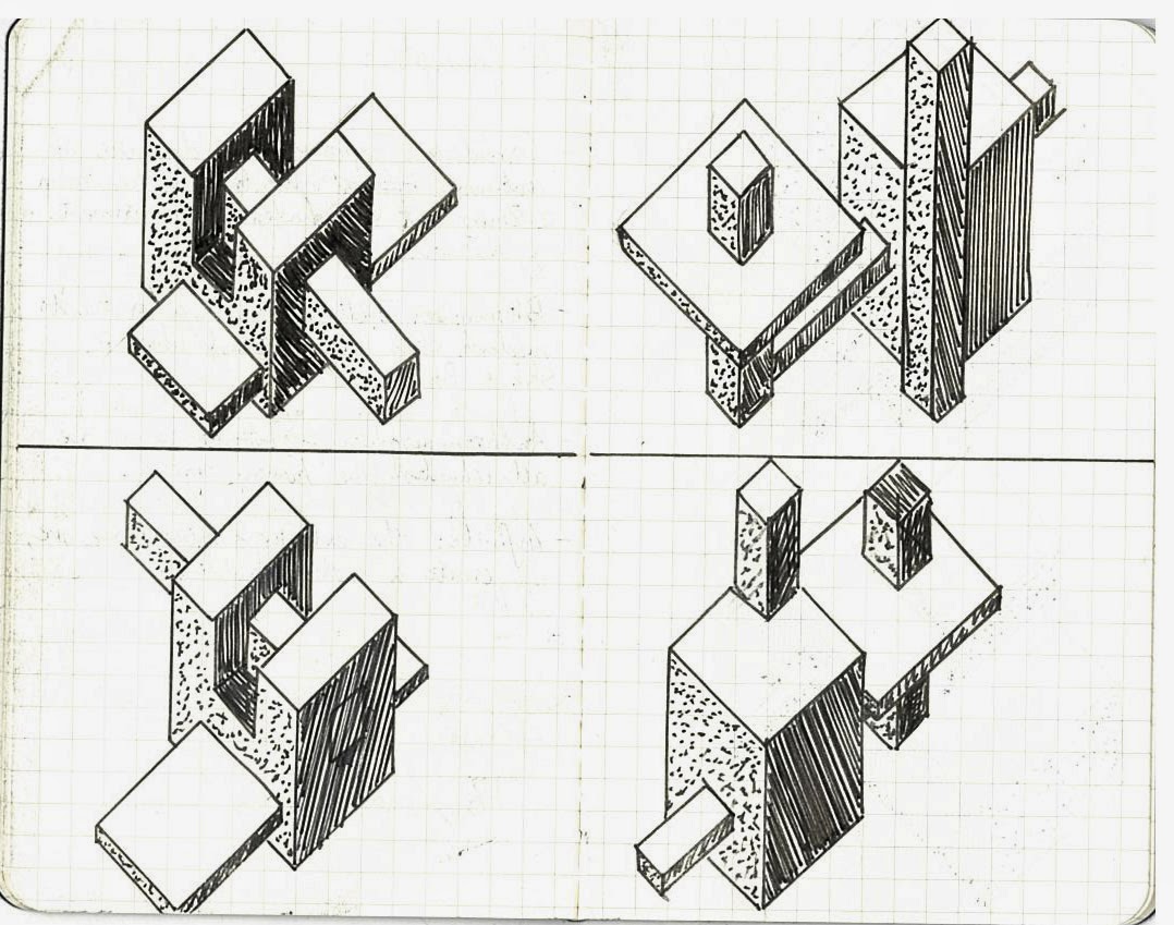
2. THE 18 SKETCH AXONOMETRICS:
3.THE 36 CUSTOM TEXTURES
This is the Final decision of the light, medium and dark patterns for the model. I didn't put pattern on the organic parts because its surface is separated by so many tiny parts, the effect is not very good... so I decided the original white color. It is very suits for the architect Preston Scott Cohen's design style at the same time..
4. THE LANDFORM:
5. THE 5 IMAGE CAPTURES AND ARCHITECTURE
Finally:
My complete lumion file access URL: https://www.dropbox.com/sh/1743pd76mmavbel/xiq-pZdQk0
Saturday, 3 May 2014
Friday, 2 May 2014
Subscribe to:
Comments (Atom)


.jpg)


.jpg)

